NOW BOOKING PROJECTS FOR 2027

DESIGN WITH GRAVITATIONAL PULL
A FEW SPOTS AT A TIME
NOW BOOKING PROJECTS FOR 2027
DESIGN WITH GRAVITATIONAL PULL
A FEW SPOTS AT A TIME


Client:
CACHAI
Made:
NAMING, BRANDING, LOGO, WEB UX/UI, BAG DESIGN
When:
JUNE 2026
PLAN SOMETHING LIKE THIS →
Cachai wanted to bring something the Dutch bike lane was missing: colour. Their waterproof bike bags carry the colours, warmth and energy of South America, and the brand had to do the same. Fun and full of life, but still a bag you trust with your laptop in a Dutch downpour.
The full brand, from the logo to the colours and patterns, and the design of the main bag itself. The trick was balancing the two sides: bold enough to stand out on a grey day, practical enough to feel like proper gear. And the mission isn't over yet: I'm now designing the UX/UI for the website, so the same bright, sturdy feel carries over to the screen.
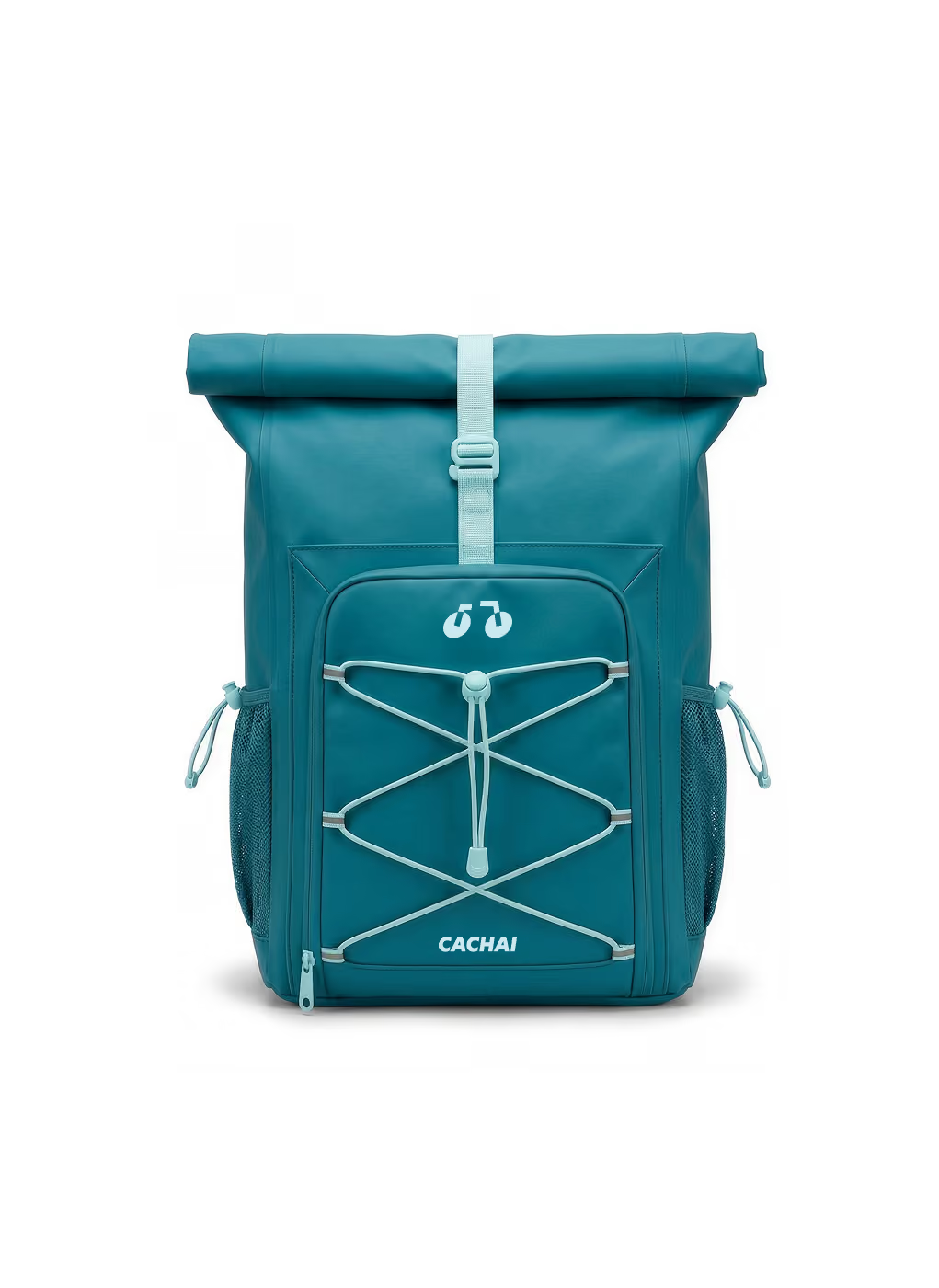
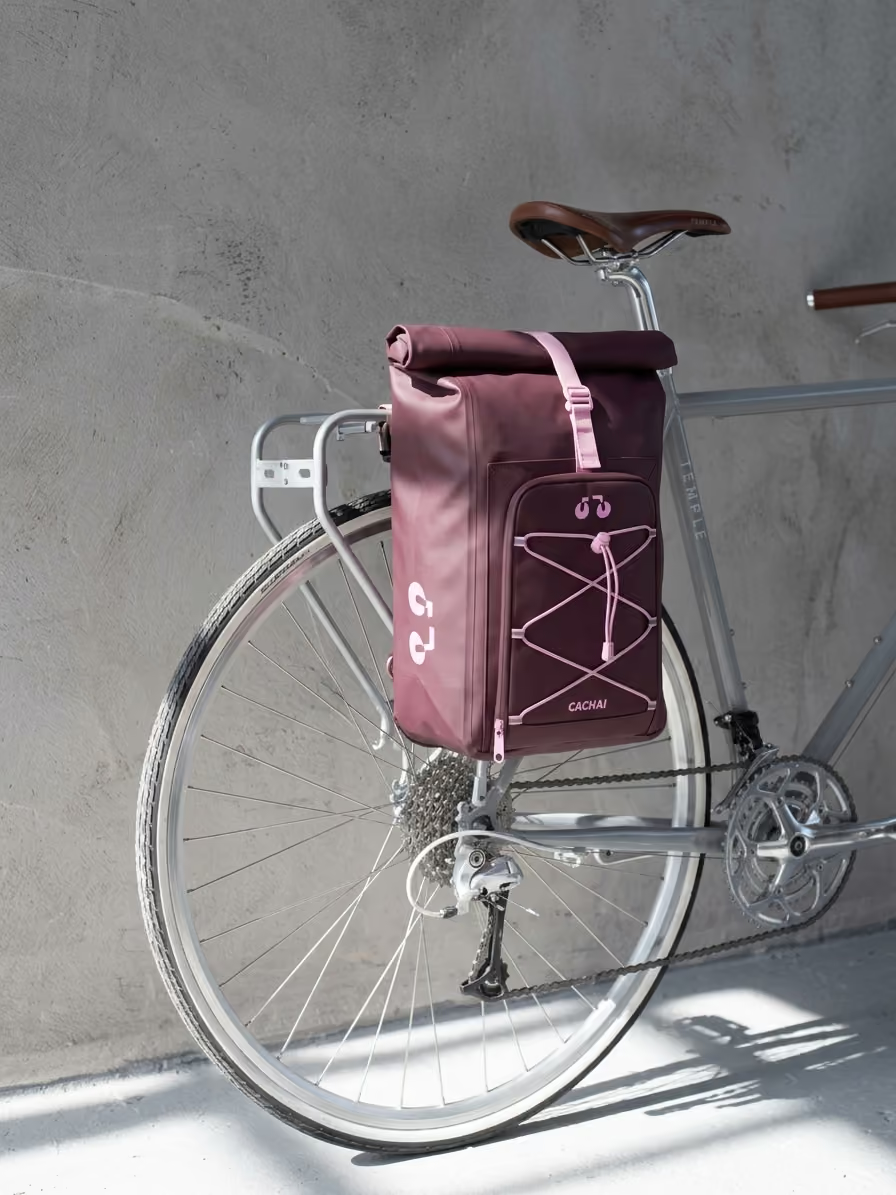
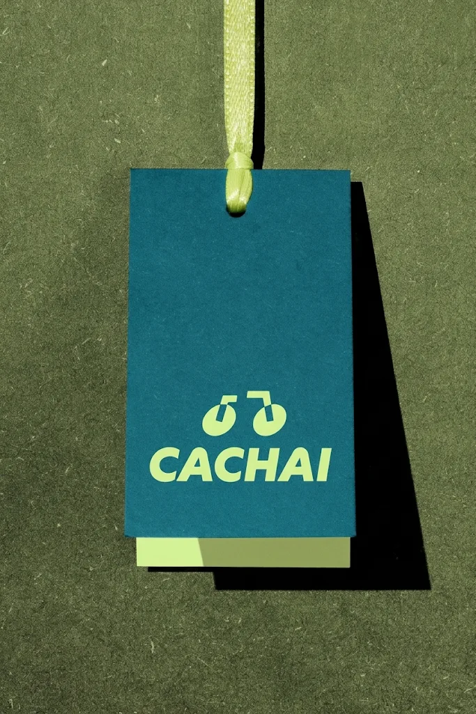
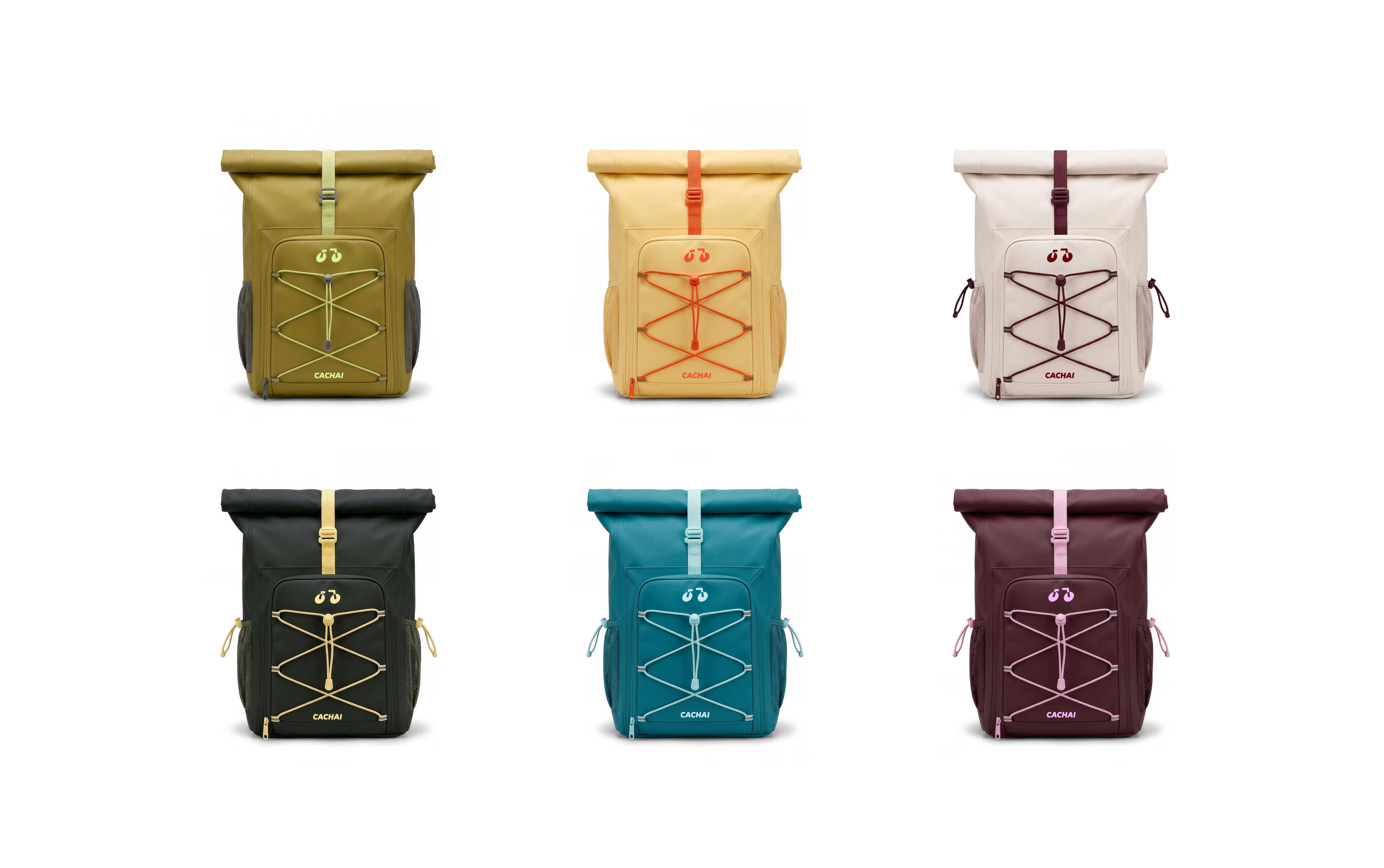
A bag you can spot from the other end of the street. And this mission is still in orbit: the UX/UI is in progress, so this page gets a sequel soon. Launching in 2027.
I loved the result, without many words Steff just got what I wanted. She understood the client, and the brand I want to create.
I take on a few projects at a time, so each one gets my full attention. Tell me what you're working on and I'll let you know if there's a spot.